 |
KETTLER WORLD TOURS 2.0 |
Analysis of single training session
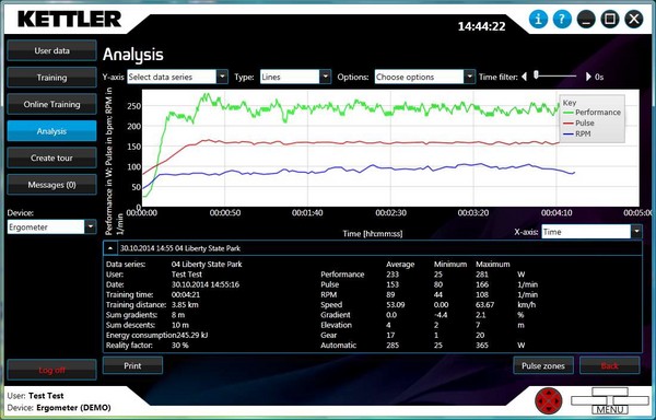
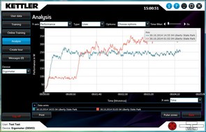
If only one training session is being analysed, all data series are displayed in the same chart. There are different data series to select from depending on the type of training.
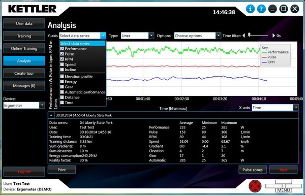
The different data series can be selected or deselected via the Y-axis.
The training information, plus a table with the data series' average, minimum and maximum values, is displayed at the bottom of the window.
Settings
Different series can be selected or deselected during training using the selection options under Y-axis. Only one data series is possible when selecting from several training units.
The following series are available in KETTLER WORLD TOURS:
- Performance
- Pulse
- RPM
- Speed
- Incline
- Elevation profile
- Energy
- Gear
- Pulse as percentage of maximum heart rate
- Automatic performance
- Distance
- Time
- Maximum heart rate
Not all data series are available with every training session. Availability depends on the source as well as the type of training.
The X-axis unit can be changed below the chart on the right. You can select between Time and Distance.
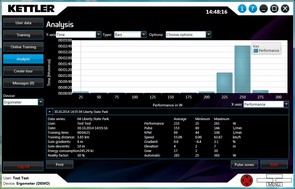
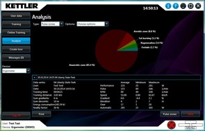
You can switch between lines, bars and pulse zones by selecting Type.
The following things can be activated under Options:
- Marker: the line's points are displayed as filled circles
- Key: The key can be turned on/off
- Average lines: a line that shows the total average of a curve
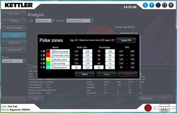
- Training zones: The pulse zones are displayed.
The Time Filter slide control smooths the training data.
Select type
3 display options are listed under Type:
- Lines: the recorded data is displayed in the chart as lines.
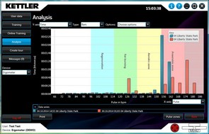
- Bars: the data is displayed as bars based on frequency over time or distance. The X and Y axes are swapped in the process.
- Pulse zones: the pulse zones are displayed in a pie chart based on their frequency.
© 2012-2026 Wolfgang Weinmann Softwareentwicklung


